Napa Redesign

P R O B L E M
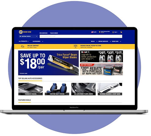
Napa’s website contains text that is lackluster and has an outdated design language
As a UX/UI Designer, I've noticed texts of all different sizes with no pattern and their categories are all over the place.

Inconsistent Experience
Inconsistent design breaks the user experience and increases technical debt. Users are more likely to be lost in the app.
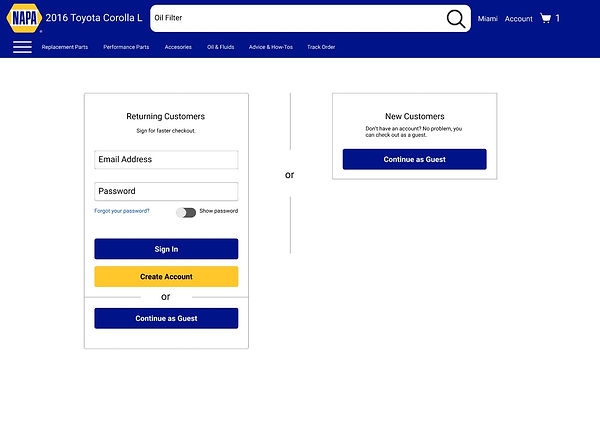
Redesign the whole checkout process
After studying the problems, I designed an easy-to-use website that requires all the needs of the buyer, as the site contains top categories, special offers, and How-Tos that empowers the user to choose what he wants and will easily be able to do it on your own.
Increase consistency of texts and relevancy
Build a popular categories system to show consumers the most relevant content based on most purchases and interests.


A delightful consistent consumer experience
To ensure a proper design system is in place to reduce technical debt, and give our consumers a better consistent experience.
U S E R S
I took a deep dive into existing behavioral and purchase data for my research
Before I started designing, I took a deep dive into existing behavioral and purchase data for my research. We also conducted a series of user interviews.
We defined 2 user archetypes when users visit the Napa website.

A heavy deal saver that looks for the best price to value purchase.
Frequent visitor to Advanced Auto Parts and O’Reilly Auto Parts.

Always wants to learn how to do it yourself and seeks satisfaction when it’s complete.
Always tries to learn various ways on fixing cars without needing help.
P R O C E S S
Created rough sketches + low fidelity wireframes + user flows
The purpose of these designs is to make the top categories and deals at the forefront of the website.

Rough sketch
This was one of the sketches I ended up using to model my design. This sketch was the 3rd iteration I created.
Low fidelity wireframe
This wireframe was the first iteration on how I wanted the design to look.

User flow
From the sketch, I created a user flow for participants using the app's core features and tasks, so I know which screens and content will go where, and if I needed to change certain parts.

F I N A L D E S I G N S
Looks new. Feels like home.
Here's a walkthrough of the revamped website.


L E S S O N S L E A R N E D + C O N C L U S I O N S
Adapt to the changing consumer behavior
I needed to stay grounded and focused on the goal, but also account for changes to the product to match the changed behavior of customers during the pandemic.
Take it one phase at a time
I learned to break down complicated designs into small, manageable chunks; this eases development.
What I'd do differently next time
Iterate as much as you can. In the beginning stages, I’ve explored so many different options to try finding the right solution for my student users- I’ve ended up “restarting” my project over 3 times with over 6 iterations of my Figma file to make sure every aspect of the app was designed with intention. Not to mention- I have a better sense to obey WCAG standards next time!
Be insight- not process-driven. Despite weeks of research + development, my first version of this case study was full of unnecessary text at this stage instead of tying everything into the bigger question- “so how does this fit into the bigger picture”? Hence, I cut down the copy by more than 60% and focused on the major points in my project. Hence, going forward I believe focusing more on the insights will improve my storytelling abilities to others.